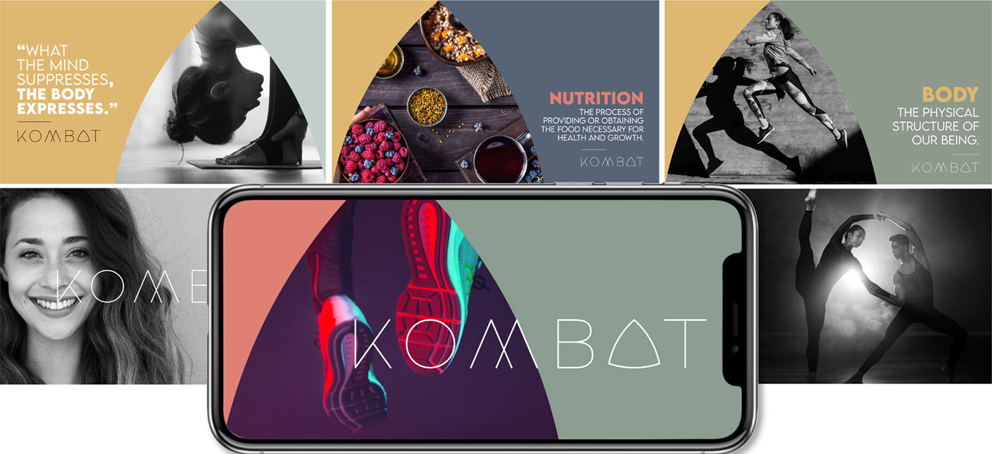
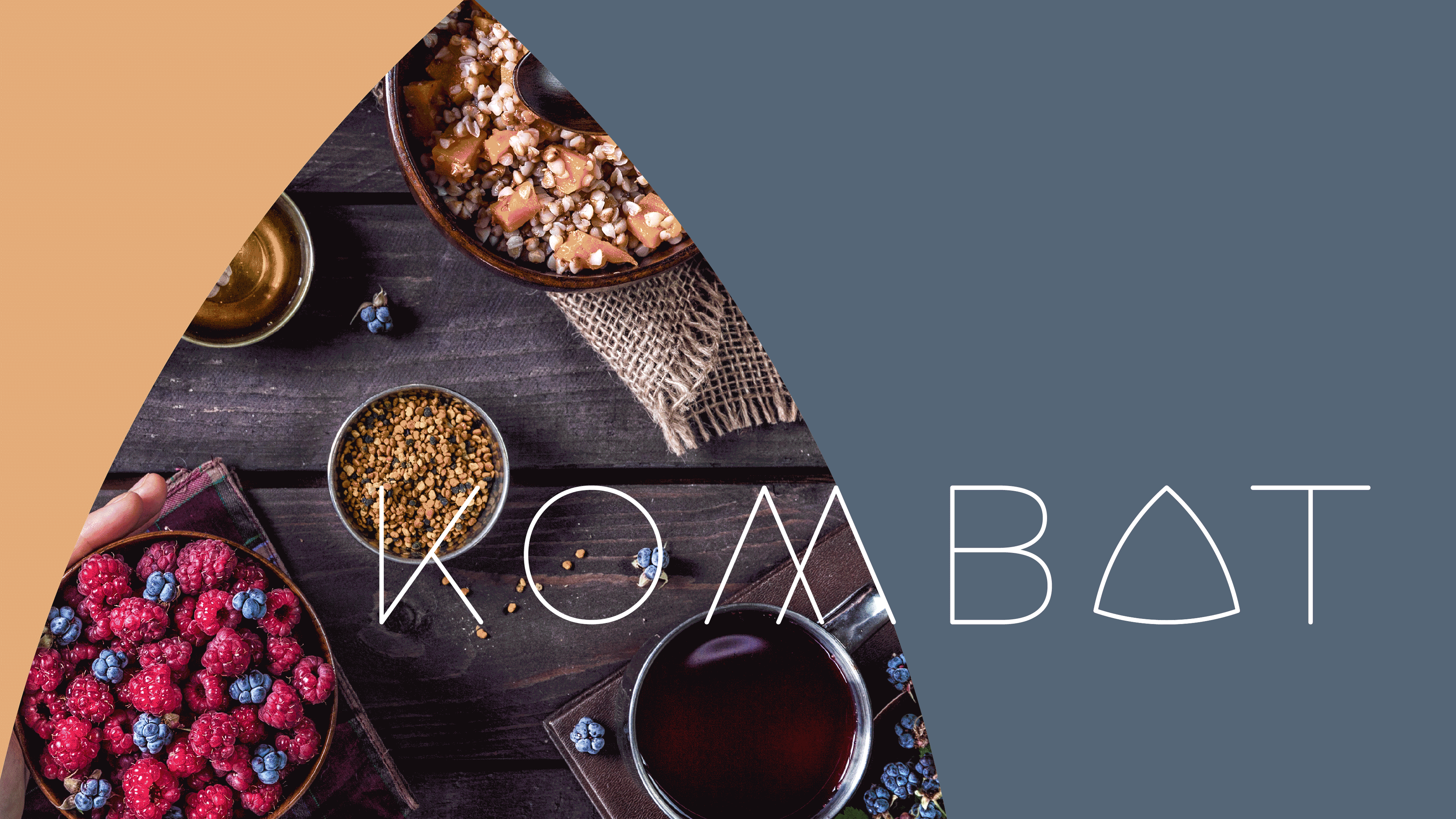
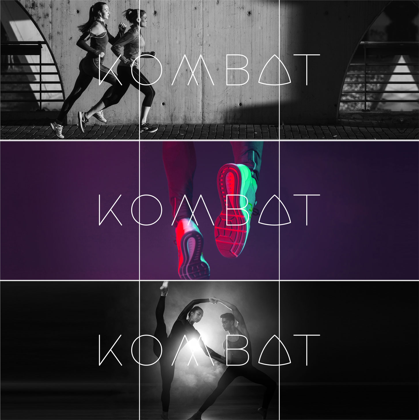
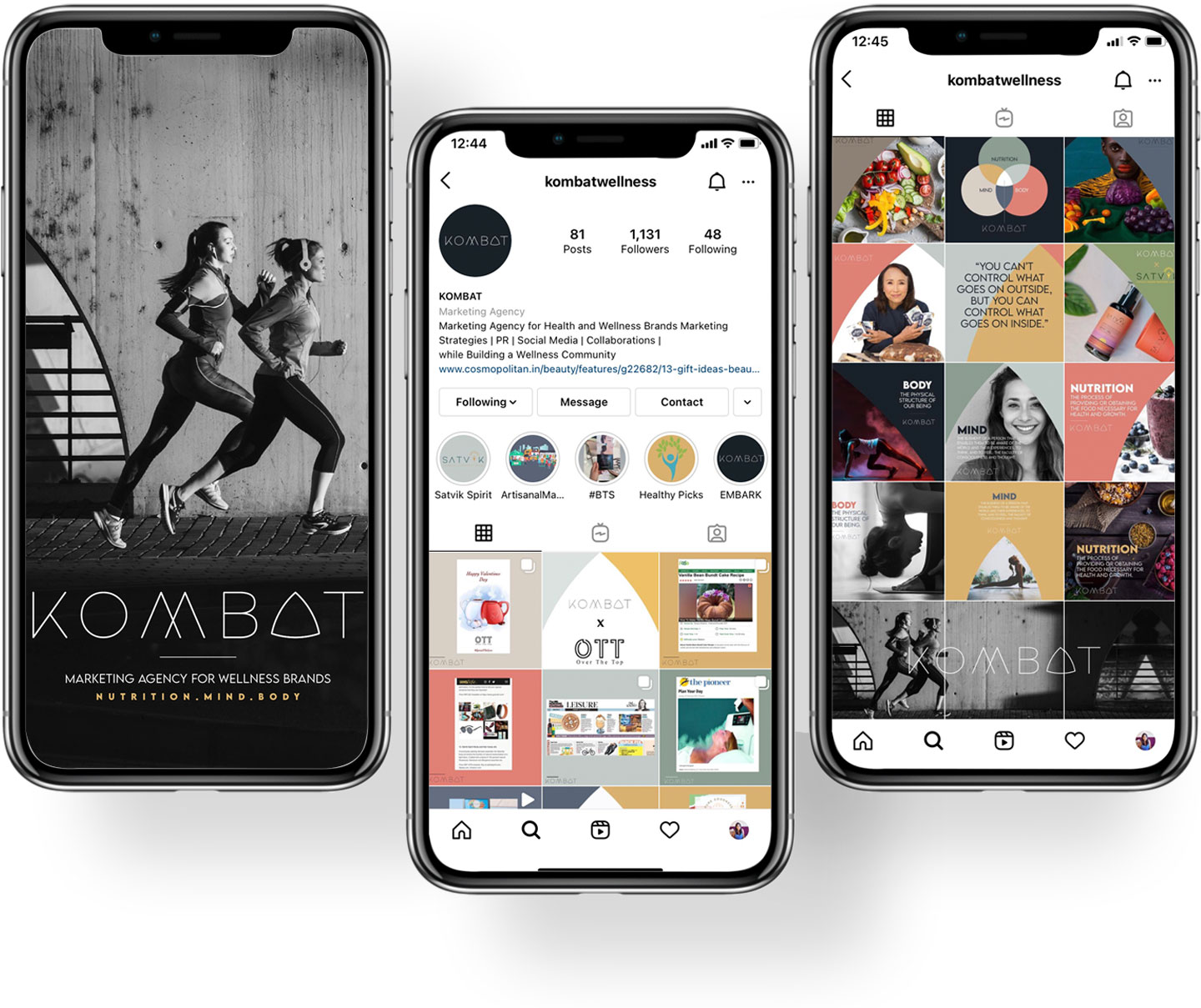
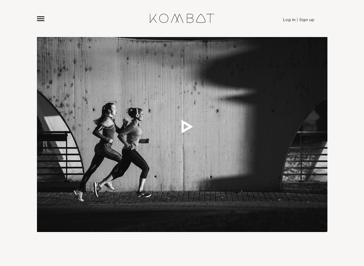
KOMBAT is one-of-a-kind marketing agency that offers a 360-degree approach for wellness brands, providing strategic
marketing advice to organisations in Nutrition, Fitness and Mental Well-being. They develop marketing strategies,
events, PR and social media for the clients in the field of Nutrition, Mind & Body, the three vital segments of Kombat.
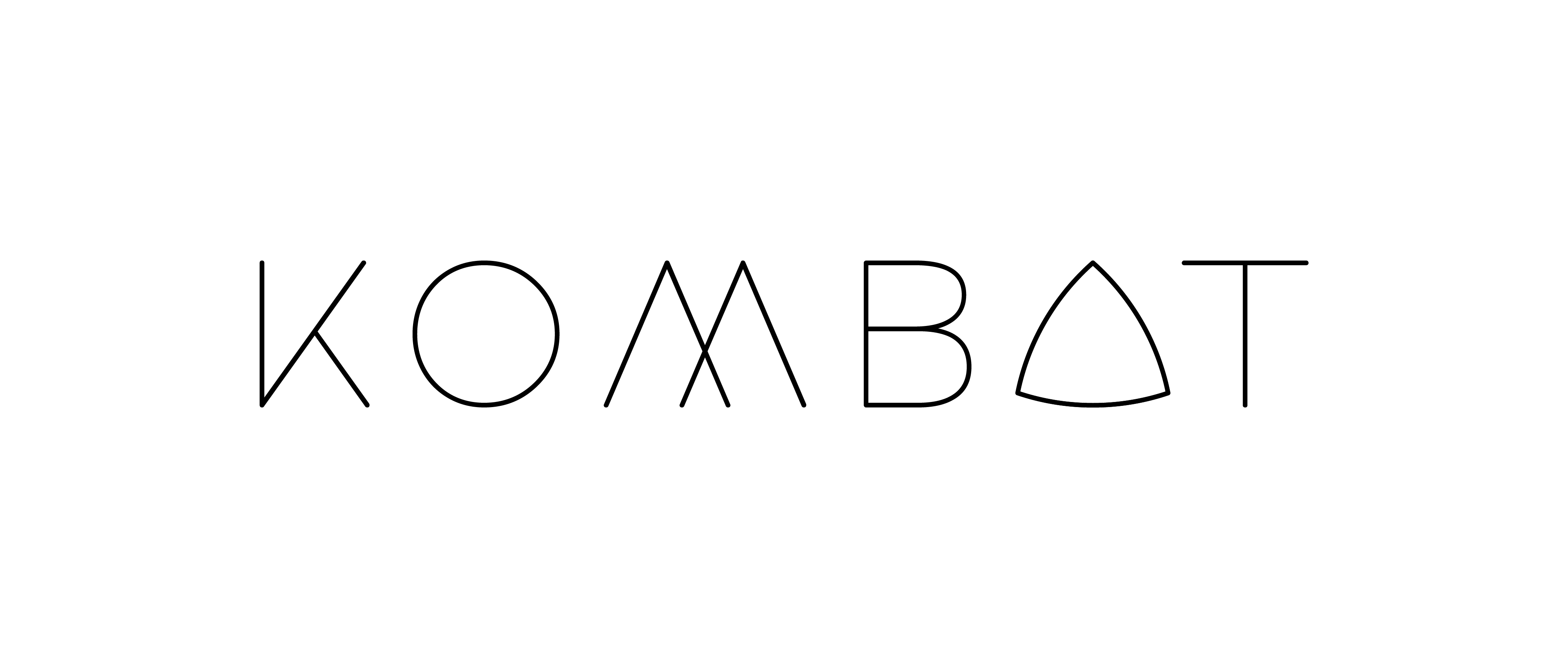
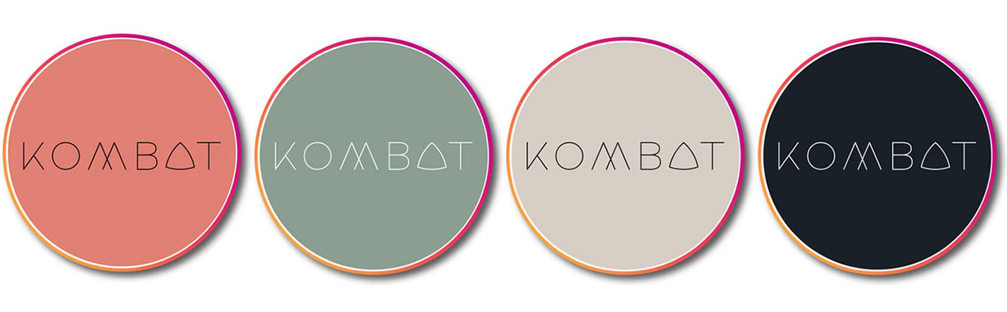
The task was to keep the logo and the brand look minimalist yet powerful as the word 'KOMBAT' itself. KOMBAT
conveys its brand presence through very subtle colours reflecting life itself. The brief also required the essence of
wellness to reflect in the logo and the visual strategy. That being a very specific ask by the client, the triangle came
about within the logo. The brand look was created to convey wellness in the modern context of visual approach.
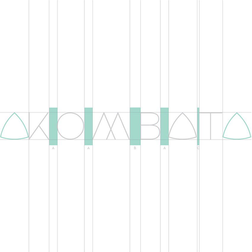
Kombat emerges where all three verticals of the brand unite.
Each arch represents one of the three facets of Kombat; Mind, Body and Nutrition,
further forming the letter 'A'.
FLESH
- C 10 M 60 Y 50 K 0
- R 223 G 128 B 116
- DF8074
ARMY GREEN
- C 50 M 30 Y 45 K 0
- R 143 G 128 B 131
- 8B9D90
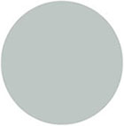
DUSTY BLUE
- C 25 M 15 Y 20 K 0
- R 192 G 199 B 196
- C0C7C4
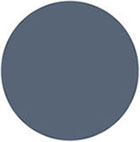
SLATE
- C 70 M 55 Y 40 K 15
- R 87 G 100 B 118
- 576476
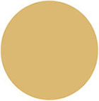
HONEY MUSTARD
- C 15 M 30 Y 65 K 0
- R 218 G 177 B 111
- DAB16F
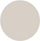
GREIGE
- C 15 M 15 Y 20 K 0
- R 215 G 207 B 197
- D7CFC5
FLESH
- C 80 M 70 Y 60 K 70
- R 26 G 32 B 39
- 1A2027
Platoon comes with 20 years of experience in brand strategy and building platforms for the
brands in need of them. The word 'Platoon' is defined as a subdivision of a company of soldiers,
usually forming a tactical unit that is commanded by a lieutenant. It intends to be the client's
INTEL partner in the industry providing them strategic intelligence to better their brand.
The creative task was to design an ultra luxurious brand identity and visual strategy for the
brand, connoting the ethos of the brand name 'Platoon', minimalistically.
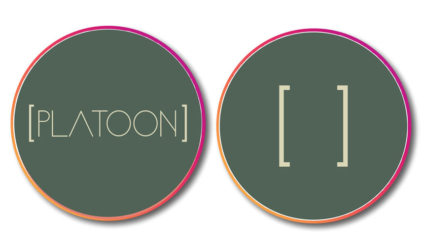
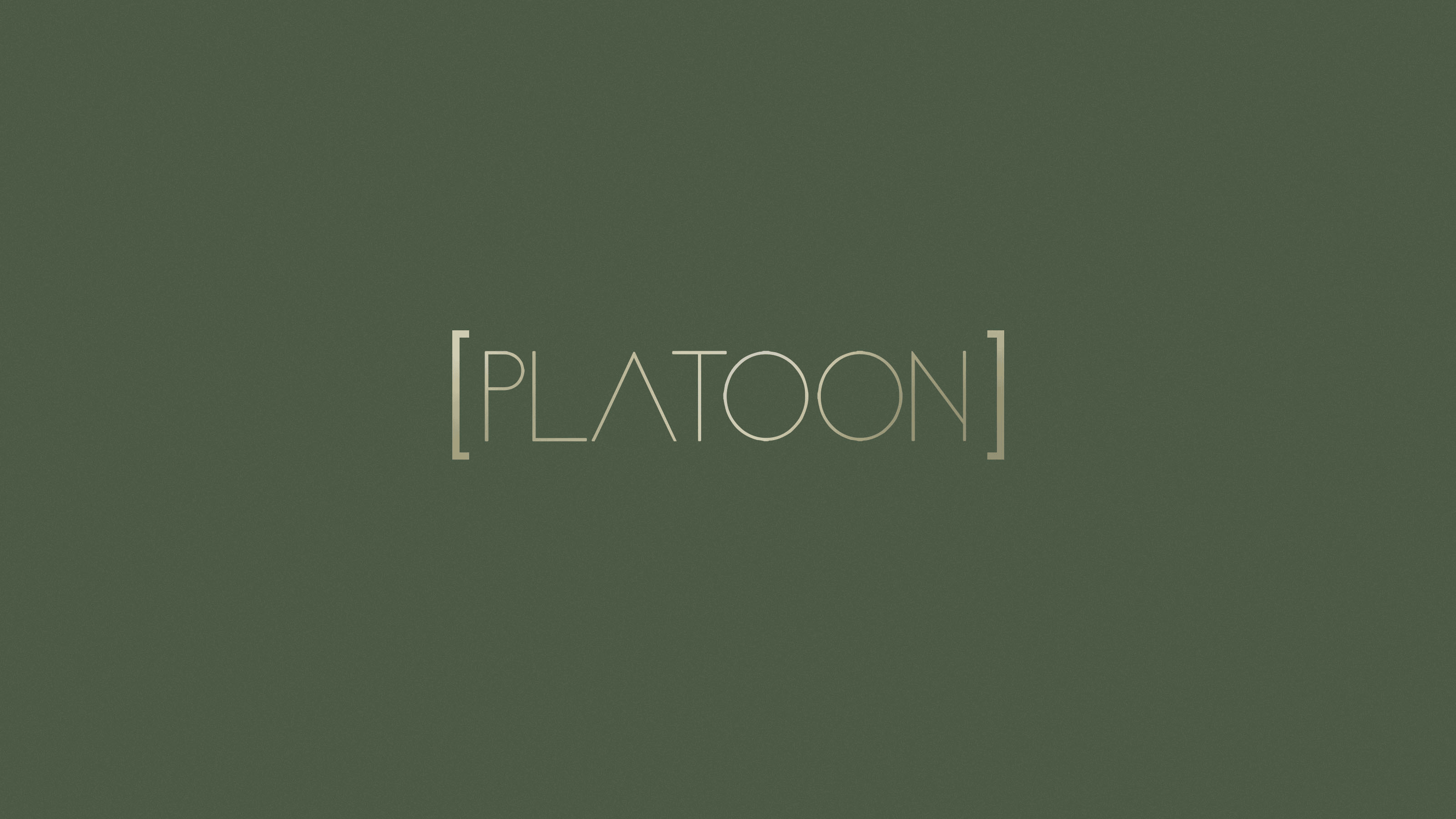
The brackets enclosing the brand name - Platoon, forms a unit in
itself, symbolising - a subdivision or an island of information,
knowledge, soldiers and troop, true to the brand's philosophy and
to the name 'Platoon'.
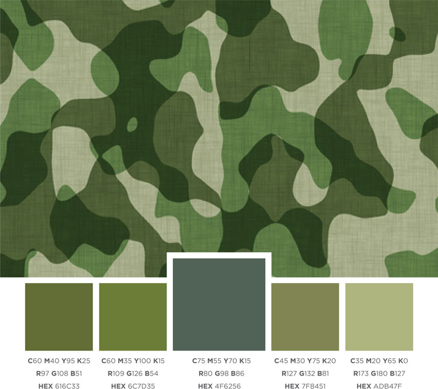
The green colour is representative of Indian Army.
The brackets became an integral element of all brand creatives,
posts, presentations and brand talks.

The brackets enclosing the brand name - Platoon, forms a unit in
itself, symbolising - a subdivision or an island of information,
knowledge, soldiers and troop, true to the brand's philosophy and
to the name 'Platoon'.
The green colour is representative of Indian Army.
The brackets became an integral element of all brand creatives,
posts, presentations and brand talks.