
Stanza Living transforms spaces into second homes for the youth of India. They create a living environment,
that's vibrant, warm and welcoming at the same time. These wall graphics, designed for the 'Hello Wall', have
greetings written in multiple languages to welcome the students and young professionals coming from different
parts of India, to their second home.


Highr is one-stop digital platform for teachers' up-skilling needs. They believe that teachers are each other's greatest
strength. They have created an online social learning platform that brings together the teachers across all career
stages and helps them collaborate.
The brief was to create a dynamic logo that represents the core brand philosophy - Teachers' collaboration,
community, up-skilling and mentoring, while retaining the original logo's element 'Paper Plane' and the existing
brand colours.
The man signifies 'the teacher' and the paper plane is symbolic of the brand name - 'Highr'.
Together, they merge to create a unique symbol connoting the four pillars of the brand - Collaboration,
Up-skilling, Community and Mentoring.


KOMBAT is one-of-a-kind marketing agency that offers a 360-degree approach for wellness brands, providing strategic
marketing advice to organisations in Nutrition, Fitness and Mental Well-being. They develop marketing strategies,
events, PR and social media for the clients in the field of Nutrition, Mind & Body, the three vital segments of Kombat.
The task was to keep the logo and the brand look minimalist yet powerful as the word 'KOMBAT' itself. The brief also
required the essence of wellness to reflect in the logo and the visual strategy. That being a very specific ask by the
client, the triangle came about within the logo. Kombat emerges where all three verticals of the brand unite. Each arch
represents one of the three facets of Kombat; Mind, Body and Nutrition, further forming the letter 'A'.


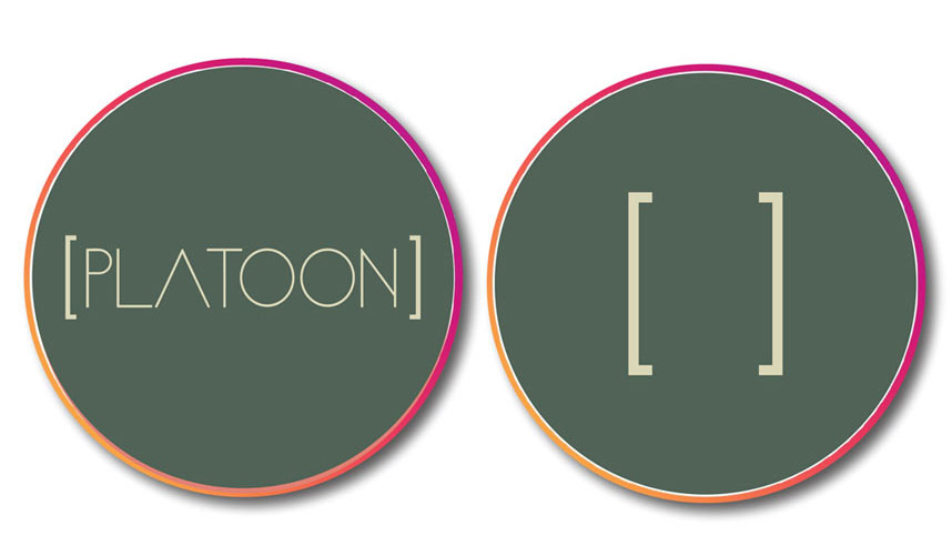
Platoon comes with 20 years of experience in brand strategy and building platforms for the brands in need of them.
The word 'Platoon' is defined as a subdivision of a company of soldiers, usually forming a tactical unit that is
commanded by a lieutenant. It intends to be the client's INTEL partner in the industry providing them strategic
intelligence to better their brand.
The creative task was to design an ultra luxurious brand identity, connoting the ethos of the brand name 'Platoon',
minimalistically. The brackets enclosing the brand name forms a unit, symbolising - a subdivision or an island of
information, knowledge, soldiers and troop, true to their philosophy and the name 'Platoon'.


August Communications, an independent advertising agency aspired to create fun and interesting
business cards for each of their employees. The cards were designed to reflect a unique personality
trait of each person, with minimalist art style and pop colours.


Global Wines & Spirits and Kimaya Fashions entered into a joint venture in 2010 to sell
premium range of Australian wines under the brand name 'Kimaya Wines'.
The Kimaya Wines range includes Kimaya Moscato, Kimaya Chardonnay, Kimaya Shiraz &
Kimaya Sparkling. The labels were designed for each of them.


Vodka, as a spirit is known to be colourless, hence can be mixed with anything freely.
So do, vodka lovers.
From there, came the brand philosophy for Rasa - 'Mix Freely'.
The brand logo was partially hand-crafted, using water colours on white paper, to create this beautiful
effect in the background.


As a part of the pitch project, an innovative outdoor idea was developed for Rasa Vodka.
Before the monsoon, a giant hoarding would be placed which will have patches of concentrated water soluble
colours. As it rains, the colours will dissolve, forming an interesting palette behind the bottle.


